If you think this is easy, you try it...
I am by nature a private man. My preference is not to show pain, suffering, frustration, etc., unless forced to by either the weakness of the flesh or a strategic imperative. So parading around my most spectacular failures on my blog is not exactly my dish of tea.
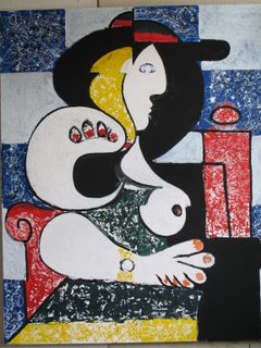
Nonetheless, you can see from these pictures that Woman with Wristwatch is going backwards, not forwards. Now, going backwards can be okay. Sometimes it's a good idea to step back and survey the terrain. Likewise, in a one-step-backwards, two-steps-forward dynamic, the step backwards is part of a productive strategy.
None of these appear to be the case with Woman with Wristwatch. To which I would add, if you think this stuff is easy, you try it.
Back to self-flagellation. If you scroll down to the "Tis Better" post of a few ago, you can see where we left off: me rueing the fact that I couldn't go back to a prevous version--one that seemed less dense, more full of air.
The difference between the two versions had a lot to do with obliterating the grid pattern behind the woman. The idea is to have adjacent squares on the grid alternate blue or white. On the white squares, you then drip blue paint. On the blue, white. If you keep this up long enough they start to look almost exactly alike. If you do it just right--as I did in Close But Not Quite, for example--you get an almost uniform background, but with a hint of conflict between each square. The way it turned out, as shown in the "Tis Better" post, unfortunately, was significantly less successful.
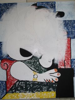
Now fast foward to this image:
I just picked up a paintbrash and re-established the grid. I also cleaned up a couple of lines, resized some elements, etc. And as I did so, I felt that familar sense of self-loathing that always comes when I pick up a paintbrush and try to fix something on an otherwise brush-free work. I always feel like I'm cheating.
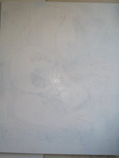
And, since I don't like to cheat unless forced to by either the weakness of the flesh or a strategic imperative, I decided to address my self-loathing by picking up another type of brush--a big wide four-inch job--and obliterating the whole fucking thing. Ahhhh--that felt better.
Ironically, this yielded what seemed to be the most powerful image to date:
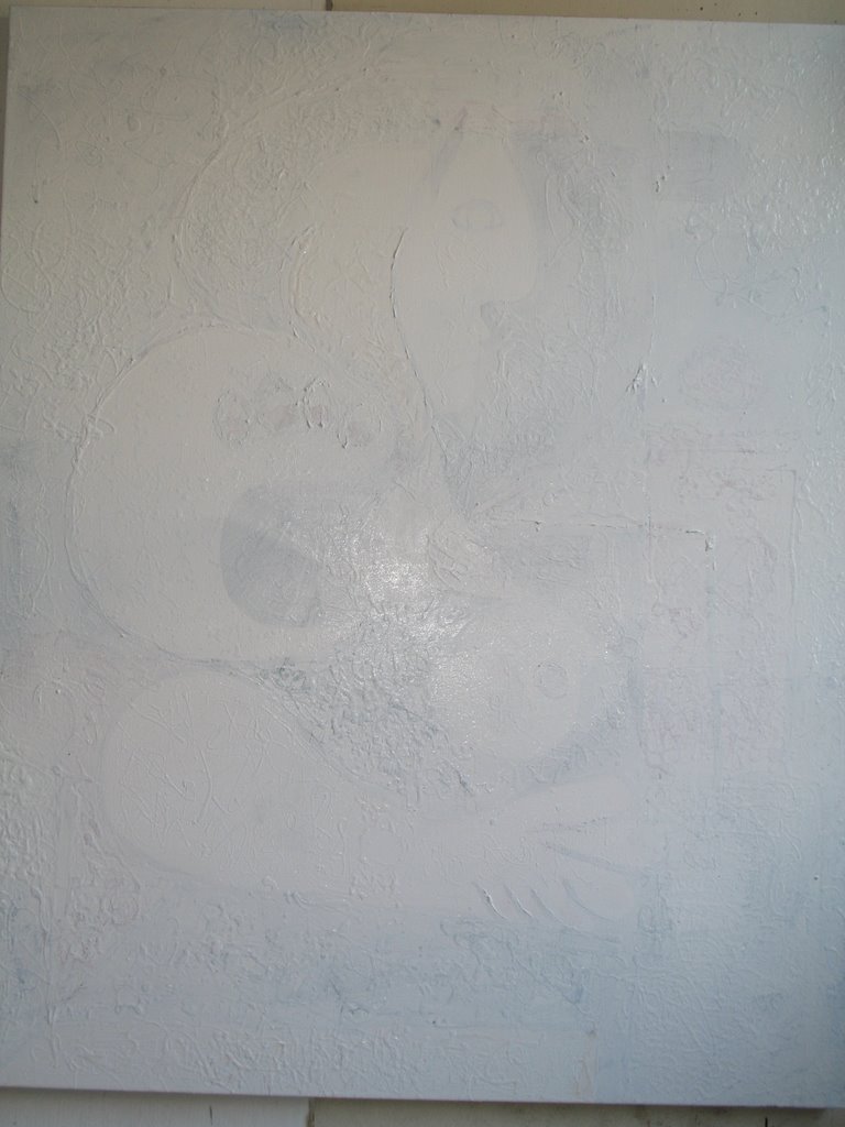
But as is often the case, I didn't stop there. I continued.
As you can see below, the task is almost done. I like two things here: First, how the original painting peeks through. In actual life, it was really quite lovely, if not a little heart-wrenching. Second, I like how the bottom left of the painting, the stuff that's left over, looks like a chicken.

But a couple of brush-strokes later, the chicken was gone and we were finished:
Gentle readers, I give you "Erased Raymond (2006)", otherwise known as "El Toro Blanco, Dos."
Nonetheless, you can see from these pictures that Woman with Wristwatch is going backwards, not forwards. Now, going backwards can be okay. Sometimes it's a good idea to step back and survey the terrain. Likewise, in a one-step-backwards, two-steps-forward dynamic, the step backwards is part of a productive strategy.
None of these appear to be the case with Woman with Wristwatch. To which I would add, if you think this stuff is easy, you try it.
Back to self-flagellation. If you scroll down to the "Tis Better" post of a few ago, you can see where we left off: me rueing the fact that I couldn't go back to a prevous version--one that seemed less dense, more full of air.
The difference between the two versions had a lot to do with obliterating the grid pattern behind the woman. The idea is to have adjacent squares on the grid alternate blue or white. On the white squares, you then drip blue paint. On the blue, white. If you keep this up long enough they start to look almost exactly alike. If you do it just right--as I did in Close But Not Quite, for example--you get an almost uniform background, but with a hint of conflict between each square. The way it turned out, as shown in the "Tis Better" post, unfortunately, was significantly less successful.
Now fast foward to this image:

I just picked up a paintbrash and re-established the grid. I also cleaned up a couple of lines, resized some elements, etc. And as I did so, I felt that familar sense of self-loathing that always comes when I pick up a paintbrush and try to fix something on an otherwise brush-free work. I always feel like I'm cheating.
And, since I don't like to cheat unless forced to by either the weakness of the flesh or a strategic imperative, I decided to address my self-loathing by picking up another type of brush--a big wide four-inch job--and obliterating the whole fucking thing. Ahhhh--that felt better.
Ironically, this yielded what seemed to be the most powerful image to date:

But as is often the case, I didn't stop there. I continued.
As you can see below, the task is almost done. I like two things here: First, how the original painting peeks through. In actual life, it was really quite lovely, if not a little heart-wrenching. Second, I like how the bottom left of the painting, the stuff that's left over, looks like a chicken.

But a couple of brush-strokes later, the chicken was gone and we were finished:
Gentle readers, I give you "Erased Raymond (2006)", otherwise known as "El Toro Blanco, Dos."
posted by Geoffrey at 8:57 AM
![]()
![]()

0 Comments:
Post a Comment
<< Home