This whole Lindsay Lohan business
Here's another Richard Phillips painting of Lindsay Lohan ...
 This is a screen cap from his movie of her ...

I'm unmoved.
All that aside, my youngest daughter went through a stage where, whenever we went to the video store (you can tell it was a while ago) to rent a movie, she wanted to see Ms. Lohan's primus opus, Parent Trap. So I've seen the movie maybe ten times. Maybe more. And young Lindsay was wonderful in it, and this whole Lindsay Lohan business makes me, in some marginally connected way, very sad.
Given this, and after reading some truly nasty reviews, I taped Liz and Dick, the biopic recreation of the Taylor/Burton relationship, to see for myself. Lohan is, of course, Liz. And then, during a quiet moment, I watched it. And it was horrible. Terrible. Insufferable. And why anybody thought anybody gave a damn about Liz and Dick lo these many years later escapes me. But that's another matter.
Did you see Michelle Williams in that Marilyn Monroe movie? Wow. I thought she was fabulous. From the first seconds of the movie, I thought she was fabulous.
From the first seconds of Liz and Dick, all I could think about was how long I had to watch it in order to be able to say to you, dear friends, that I'd (likely on your behalf, since I doubt any of you watched it) given the flick a fair shot.
Ten minutes was my number. After which I washed my eyes out with antibacterial lotion.
It's fun to compare the painting and the screen shot though. To quote the woman named Astrid in my lengthy metaphor of several days ago, "Man, that guy can't paint worth a shit."
Thank God the painting is five yards wide.
It's okay for me to say this, since people say mean things about me all the time. Consider this comment from the Dealbreaker coverage of Portrait of Matthew Martoma, In the Style of Roy Lichtenstein.
"This is fucking terrible."
Is it?
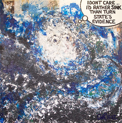
I kind of like it. And I haven't even put the gloss varnish on it yet.
Another guy wrote "More Pollock than Lichtenstein." Which is, of course, true.
Somebody I know wrote me and said he would have preferred that the face look more like Martoma's. Which also holds water, although I explained in response that it was a conscious decision not to even try for a resemblance; to make it more of a general statement (despite the specific title).
Me? To me, it has all the stuff in it that I was shooting for:
--Interesting bits of newspaper peeking out (although I'd have liked one significant peep on the bottom half of the painting).
--The caption turned out well.
--The sense of infinite depth that I like to have at least somewhere on my paintings (in this case, almost half the damned thing, but there you are).
--Compositional strength.
--And enough random acts of violence that I can privately enjoy but which will not be immediately evident to anybody who didn't paint it.
I'm also quite fond of the little blue and white tip of a wave that can be found exactly at the 3-o'clock mark.
So I'm pretty happy with it.
Also, if you look directly below the face, about where a collar bone might be, you can see two long, almost horizontal lines. These are wrinkles from where the newsprint exerted its own will. I love stuff like that because it gives the appearance of the painting having been slapped together when, in fact, it wasn't.
Immediacy is the quality I'm searching for. Those wrinkles give it some immediacy.
Which I like.
posted by Geoffrey at 10:09 AM
![]()
![]()

0 Comments:
Post a Comment
<< Home