A genius with the nipple
A friend of mine told me he was going to see a Tom Wesselmann retrospective. I responded by saying something along the lines of "The man's a genius with nipples." A week later, after seeing the show, my friend wrote "The Tom Wesselmann exhibit was stunningly beautiful."
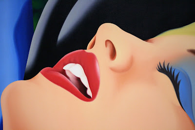
I'll buy that. I like Wesselmann. Here he is, displaying his particular genius in what one might call a characteristic manner ...
The guy's got a lot going on, from Alex Katz to Roy Lichtenstein to Mark Kostabi (of whom I'm not particularly fond) to, certainly, my boy Matisse. And nipples aside, I particularly like this image, if for no other reason than that it relates to some comments I made several posts below about the close-ups of the mouth of a beautiful woman in a car commercial ...
I also like it because it's quite lovely. That whole sun-drenched-southern-California-airbrushed-eroticism thing in spades.
As a structuralist, I'm a big fan of Wesselmann's recurring theme of just depicting a similarly colored mouth and nipples amidst a sea of what seems like silk-screened flesh. And because this blog is nothing if not self-serving, I'll call your attention to this bit from a post several months ago ...
____________________________________________________
I call it "Tosha et al". It was either that or "Benefits Supervisor (Pregnant)". The kid you can't see is now two or three years old. I wanted her to pose completely nude, but she felt more comfortable wearing a thong.
Which was fine. It's her body, she can show it to whomever she wishes. Or not.
I like this painting but I don't love it. But I do love the nipple at the bottom. The idea was that the top nipple would be all business. I mean, a very straight-forward depiction of an anatomical feature. The thinking with the bottom one was a kind of diaphanous, half-nipple/half-rose kind of a thing.
Picasso, who -- like the black and white cookie -- must be with us always, friends, was of the notion that you shouldn't paint a person's two eyes the same way. One should be different from the other. So this is something a bit like that.
You could argue that the color is a bit too technicolor for real life. Fair enough, but I was also in love with the idea of all the reds almost matching -- the sofa, the nipple, the deep shadow, her lips, belly button, etc.
All that aside, drag the picture onto your desktop and enlarge it as far as it will go. Scrounge around in it. Luxuriate in its splendidness.
____________________________________________
Not completely the same kettle of fish, but not that far from it either. I should drag myself down to Richmond to see both my friend and this show. The train might be a giggle.


0 Comments:
Post a Comment
<< Home