Tuesday, October 31, 2006

Chuck!


Ahhh...Chuck.

Chuck was one of those paintings that made me (still makes me) feel like I've got something going on. It's one of those paintings that I like to look at when the painting I'm currently working on looks like shit and there doesn't seem to be a way out.

Chuck is also featured on Pricelist!--4th item down.


Please don't contact me about purchasing Chuck (although let me tell you, the price would scald the skin off your fingertips) as it is already part of the collection of Charles and Wynn Susswein, my most fervent and dedicated collectors.

Blue Stephanie Turns a Corner

When Blue Stephanie was last seen, one wag described her as the crossroads between Sandra Bernhardt and the phantom of the opera and, maybe, a little bit of that guy who played a recurring role as Charlotte's gay friend on Sex and the City.


Me? I just thought of it as a work in progress.

I also thought of it as a version of my current life in a nutshell. I say this because I was leaning over the canvas just before this picture was taken, dripping a little red on her lips, when I realized that I had bent too far over and the red paint was pouring out of my Victoria Gourmet 1.2 oz tin onto the surface of the canvas.

You can see it all over the side of her face beneath her ear. This is my life in a nutshell.

Anyway, then I thought of John Constable and his great love of putting little dots of color--often red--at strategic points around his landscapes to carry the eye about, help focus on the matter at hand. That helped, but only in the way massive self-delusion can. In the end, it was just a bunch of red paint on the surface of my beautiful painting.

Then, after taking Friday and Saturday off, I decided to get serious. This is the result of one pretty intense Sunday:


I do think she's beautiful. Even in her premature, unformed way. You?

A lot of what happened on Sunday had to do with the mouth and eye(s), and a lot of that was done with the tip of my finger. I used an antique gold for the color of her eyes, which under normal light reads as hazel but in the full frontal assault of my camera flash glows in the same way a vampire's eyes might.

And the hair, of course. I wish I'd taken more pictures during this spasm of effort, but sometimes you just focus on the matter at hand. Also, with paint all over my fingers I am loathe to mark up the shiny aluminum exterior of my camera.

I do very much like how the left side of the face is beginning to peek out of the shadows.

And, while we're naming famous painters, the contrast between the shadow and light on her flume is very much my Edward Hopper moment.

This little triumph aside, however, I am troubled at how, despite my protestations about pinks and blues, Blue Stephanie seems to have turned into yellow/brown Stephanie.

I promise you this is just a phase. You can still see some pink beneath her eye, and we're still a long way from home.

Friday, October 27, 2006

Our First Corporate Sponsor


November's Corporate Sponsor (and our first) is Victoria Gourmet, a purveyor of all natural seasoning blends, culinary sea salts, brining blends, and gourmet ingredients. Click either here or on the sidebar to go to their website.

Now consider this:
Geoff's Moroccan Pasta

Set out a couple of ounces of plain goat cheese til it reaches room temperature
Cook some whole wheat linguini or, if you're flying off the handle, bowties
Also cook some fresh peas. Do this at the end, and only for the shortest period of time. I like a crispy pea. My grandmother used to tell me it should take longer to take a pee than to cook one!
Drain the pasta, reserving a quarter cup of the liquid
Return the pot to the stove on very low heat--just enough to help melt the goat cheese
In the bottom of the pot mix the goat cheese with several tablespoons of olive oil until it forms a loose, creamy sauce. It should be about the consistency of Benjamin Moore paint (my brand of choice--would'nt it be great to have them as a sponsor)
Add 2 tsp of Victoria's Moroccan Seasoning* to the sauce, plus some roughly chopped black olives plus, if you're flying off the handle, a couple shots of Frank's Hot Sauce.
Toss in the pasta. Loosen first with a little more olive oil, then with the reserved liquid.
Salt and pepper to taste. (I love all of Victoria's Sea Salts and her Pepper Mill Mix)
Serve by heaping a mound of pasta in the middle of a black plate.
Garnish by indenting the pasta with a spoon and then filling with freshly cooked peas.

Me? I love the sweetness of the peas against the spicy richness of the Moroccan blend, and the black plate makes the olives really pop visually. It makes me feel like Paul Bowles.
*you can also use Victoria's Tuscan Seasoning for a slightly less exotic effect
Now you may be asking why Victoria Gourmet is our November sponsor. If you look closely at the photo above, you can see that I use the same metal tins for some of my mixed paints that they will use to ship you your Tuscan and Moroccan Seasoning blends.

Victoria herself--the one who (if you work at Victoria Gourmet) must be obeyed--sent me a dozen empties, and they have been a boon.

Stop reading now and go immediately to her site. It's full of holiday gift ideas for that special person in your life.

Thursday, October 26, 2006

El Toro Blanco redux

In addition to the Portfolio and the Blue Stephanie sequence, you can also access The White Bull sequence by clicking here.

The White Bull sequence is a jaunt through about 25 images (all previously shown here, but not in one place) that will take you, gentle reader, from a white, gridded canvas--the so-called White Bull--through a series of images so inept that I had to, eventually erase them (twice) to become finally, in the end, the beginning of Blue Stephanie.

My Current Portfolio On Display

Through the miracle of Picasa, you can now click to my current portfolio as well as the entire sequence of photos chronicling Blue Stephanie here.

I find the "slideshow" function to be the easiest way to look at the stuff.

Wednesday, October 25, 2006

To Infiniti...And Beyond

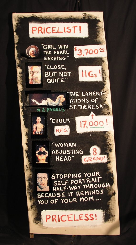
I think it was the great philosopher Buzz Lightyear who first uttered the words: "To infinity... and beyond!"-- a statement of breathtaking boldness and optimism.

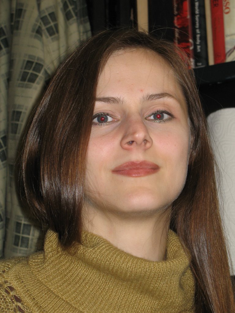
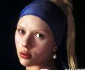
I thought it might be nice to reflect on just how lovely the actual Stephanie C. really is. I do so as a reminder for readers with short visual memories and/or are too lazy to scroll down a couple of posts to see the photo of the woman herself.

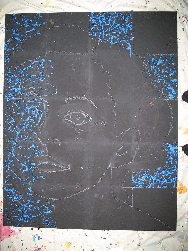
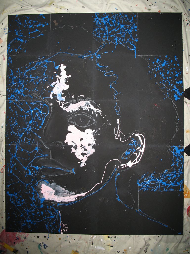
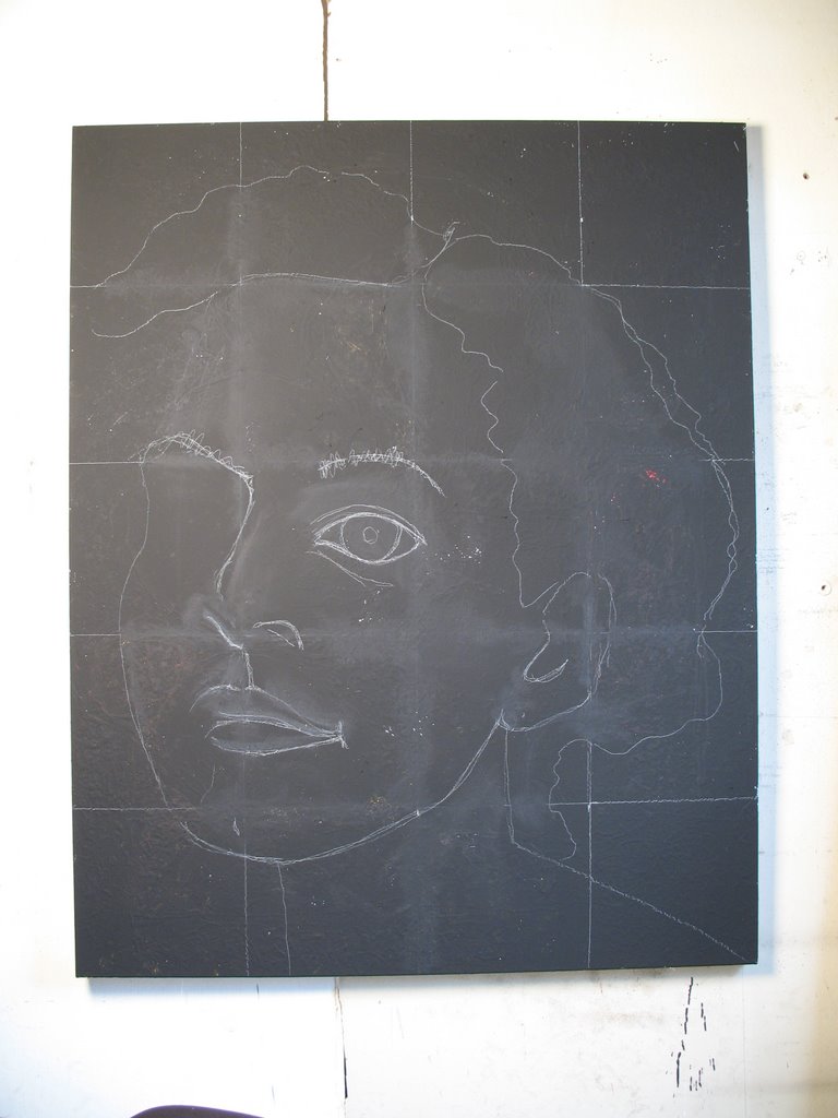
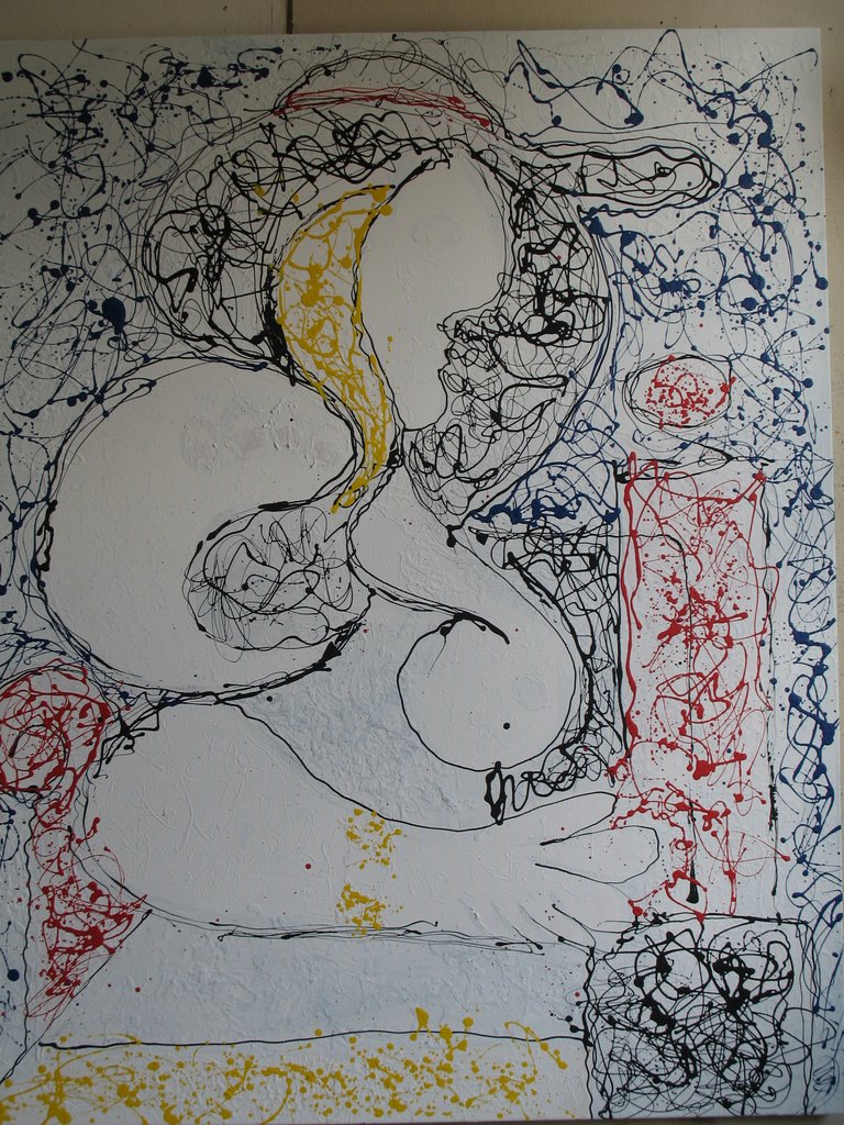
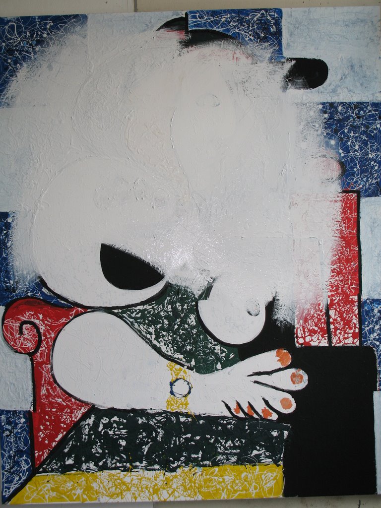
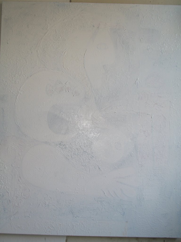
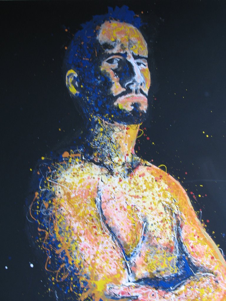
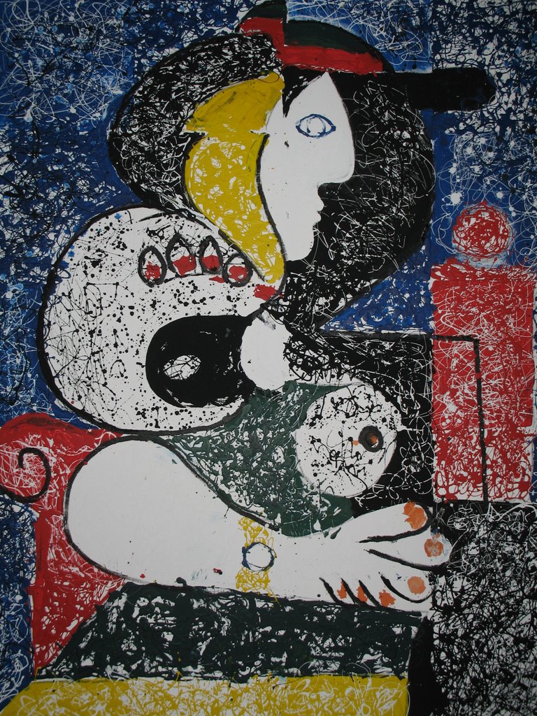
Because as things stand now, 
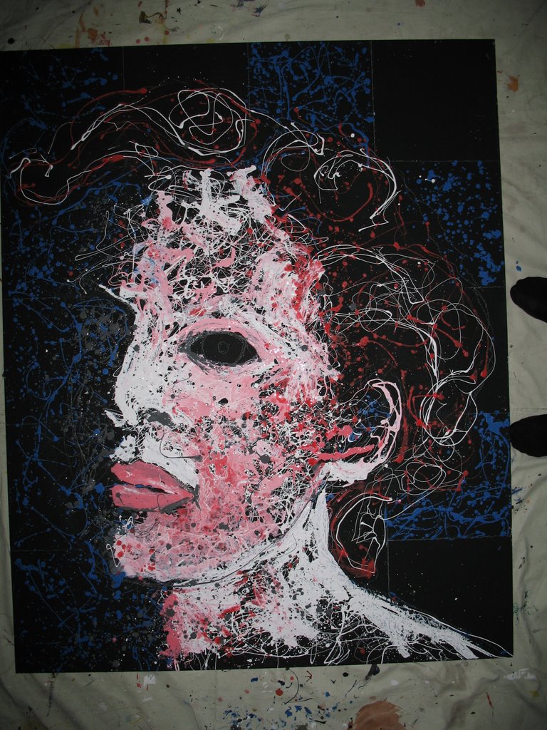
Blue Stephanie is not doing the girl any favors.

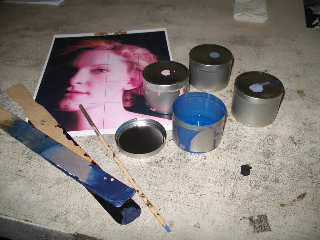
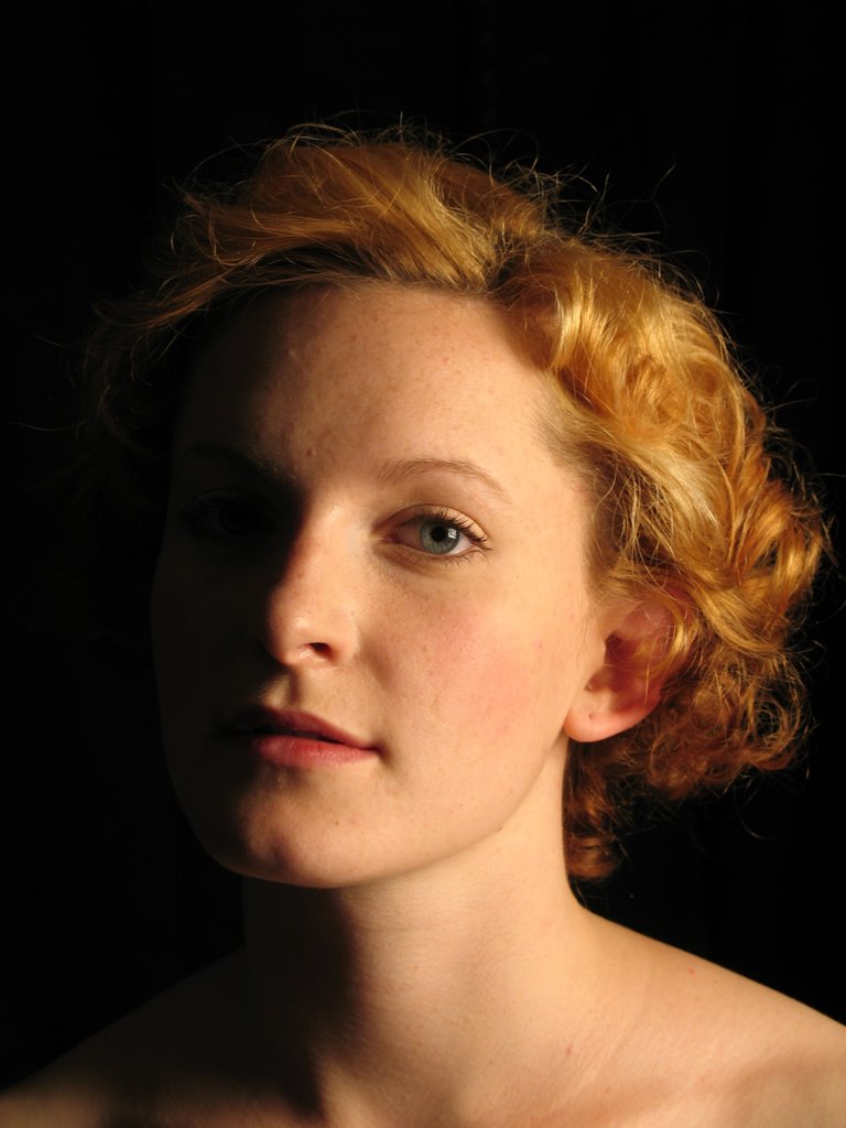
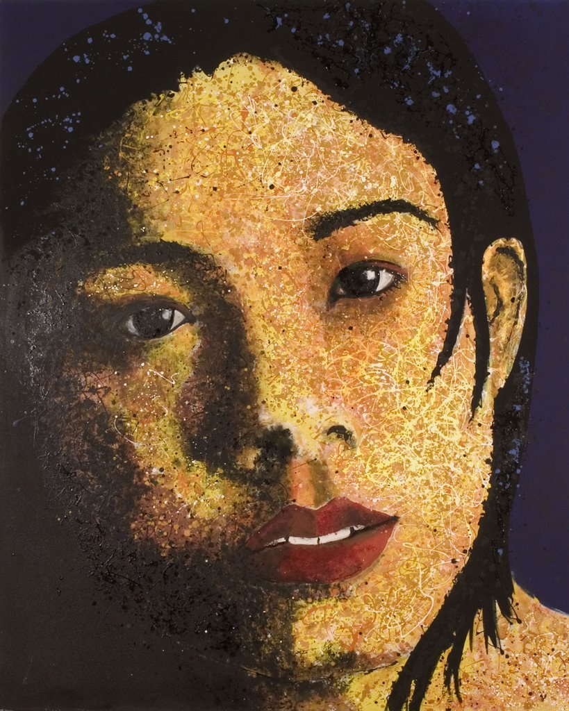
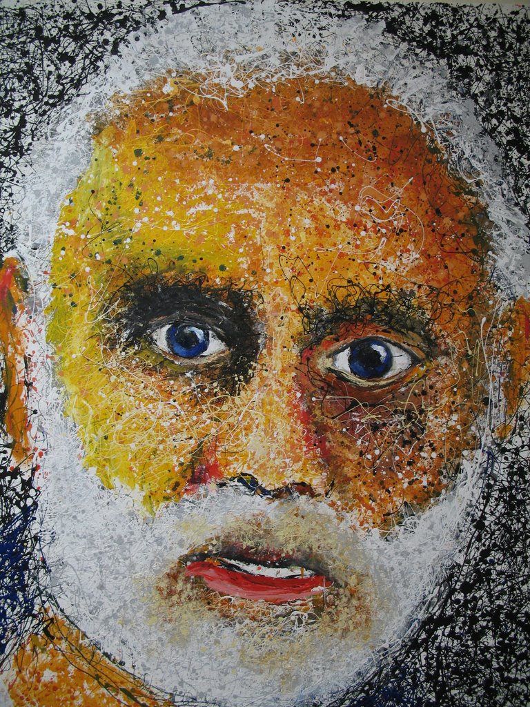
This, I should add, is just as it should be, but still... So here is the actual photo of Stephanie from which I am expected to paint my masterpiece:


Look how lovely she is. It may be just me, but if you look at this picture long enough (which I have, sitting in the studio, shifting my gaze from the painting to the photograph to the painting to the photograph, drinking cheap French vin rouge, listening to Blonde on Blonde) ...

I'm telling you, if you look at this picture long enough, don't you just get the urge to scratch the back of your ear with your foot and howl at the moon?

It might just be me. But I have spent a good deal of time closely examing this picture. And the face it contains. And while I have a couple of thoughts--several, in fact--I've now distilled them into just a simple one for your reflective pleasure.

It all has to do with the line of her jaw!

Forget for a moment the cool green eyes and that gentle (but at the same time slightly cynical) stare. Forget the dimple at the side of her mouth that makes her cheek seem charmingly soft, leavening her otherwise-crisp feature lines. Likewise, forget for a moment the hint of a cleft in her chin. Instead, focus on her jawline. I love how the tip of her chin forms a nice straight line as you emerge from the shadows and head east southeast (if you will), then takes a dramatic northerly turn, heading east northeast for a while, then turns north yet again, plotting a northeasterly course for the bottom of her ear.

As a quick aside, it is also amusing to note that the outline of her ear almost exactly matches the outline of her jaw. This is either a coincidence, a small miracle, or something to do with fractal geometry.

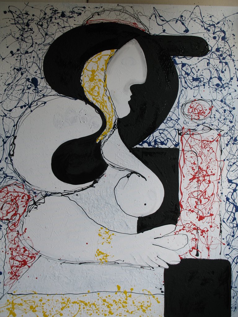
And then it struck me just what it was that appealed to me so much. This same collection of lines and angles I've just described, if inverted, exactly encapsulates the complex visual geometry of transition from the rear trunk lid to quarterpanel of a 1991 Infiniti Q45.

Can you see it? To me, it's as plain as the nose on her face.

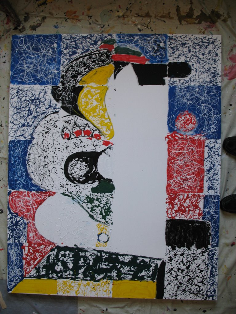
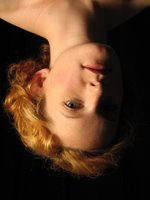
If the inversion thing is tricky for you, try this:


Now compare it to the back of this car:


Are you getting it?

I owned a '91 Q45 and, to paraphrase Teri Hatcher, it was spectacular. So imagine my range of emotions the morning I walked out of my house, one day, now many years ago, to find that my oldest daughter had driven her mother's Toyota into the side of my beautiful Infiniti and thus, improbably, totaled it.

As I remember it, the famous parental standby line-- "At least you're okay" (the very one I used, verbatim, when she rolled my Land Rover down a ravine a year or so later) never even dawned on me.

I'm still reeling. I was so fond of that car.

But isn't life a funny thing; that something as mundane as painting the portrait of a girl who works in a local restaurant can, under the right circumstances, transport the soul to infiniti... and beyond?

Go figure.

Picasso Is Always With Me/Everybody Must Get Stoned

De Kooning has said, and been previously quoted as same in these very pages (if that's what these are), roughly: "Picasso is always with me."

Me too.

The actual quote can be found in this excerpt from a New York Times article about Picasso's influences on modern painters:
De Kooning said something oddly similar, out of frustration, when Picasso died in 1973. An interviewer asked him about Picasso’s influence. “There are certain things I like to keep to myself,” de Kooning barked. “He’s always with me — certain artists are always with me. And surely Picasso is one of them.”
But it is with the continued evolution of Blue Stephanie that I discover another truth...


First of all, this is one scary looking chick! I'm reminded of that exhibit floating around the South Street Seaport called "Bodies."

But that's not the great truth. The great truth has to do with the almost psychedelic feel to the image now that the hair is starting to grow in.


The great truth is: Dylan is always with me!


Everybody must get stoned.

Tuesday, October 24, 2006

I'm Not Wearing Any Pants!

Readers with long memories will remember my post entitled "Levi 501 Button Fly Jeans" in which I went to some lengths to describe that moment at which, after having stared at an unfinished painting for long enough, you know what needs to be done; you stand up; and you rip off your jeans so you can commence painting.

"You" in this case obviously means me. And the reason you are ripping your jeans off is so you don't get paint on them. And the reason you wear Levi 501 button flies is that they are the easiest to rip off at a moment's notice.

So, in the interest of clarity, and of honest communication, and to help communicate the reality of being me during this year of magical painting, I feel obliged to tell you that I've taken these pictures with my Canon 620 but without my pants.

I'm not wearing any shoes either--as you can tell by the presence on the right side of the following images of my sock-shod toes--but I didn't think that fact made as dramatic a headline as "I'm not wearing any pants!"

But enough with the marketing strategies. Let's get back to the matter at hand--namely, the sequence of photos below. This, as you may be able to tell, is the beginning of the sequence of photos that will chronicle the creation of the painting hereafter known as "Stephanie C. (Blue Stephanie)" or, more simply, Blue Stephanie.

You may also remember the plan I laid out in the previous post. Part of it went like this:
So I see the dark blue checkerboard effect on squares 1, 3, 8 and 16.

At the same time, I see squares 5, 9, 13 and 17--what you might call the shadow squares--as being blue as well, bleeding up against the brightly lit portions of her face--the right side of the nose, the chin, the front and side of the forehead.


Mission accomplished. I then continued:
"As for the pink--I'm all over 6, 11, 15 and 18. I see cream on the rest."
This is the pink:


And this is the cream:


And this last one is more pink and cream, and then some black, which you can't really see but which will be instrumental in blurring the lines between, say, the left side of her forehead (which should be hidden in shadow) and the right (which is brightly illuminated).

And the dribbling of red--which is really just intense pink, or pink without the white--helps pull the whole thing together.


Thus far, the plan is working.

Monday, October 23, 2006

Everybody has a plan...


This is Stephanie C. sketched on a four by five foot canvas, shot while hanging against the wall. You may notice that this version includes a line on the left side of the canvas that defines where the side of her face is. In reality, this line, and the details of this side of her face, will either be barely suggested or completely lost in the shadows. Likewise the eye you don't see. The sketch in the earlier post is actually a subsequent version. I took a wet rag and rubbed out the line. I decided I didn't want to actually know where it was.

Organzed in a one-foot grid, you can identify specific parts of the painting by a number corresponding to the grid. Schematically, it is like this:

1 2 3 4
5 6 7 8
9 10 11 12
13 14 15 16
17 18 19 20

So I see the dark blue checkerboard effect on squares 1, 3, 8 and 16.

At the same time, I see squares 5, 9, 13 and 17--what you might call the shadow squares--as being blue as well, bleeding up against the brightly lit portions of her face--the right side of the nose, the chin, the front and side of the forehead.

As for the pink--I'm all over 6, 11, 15 and 18. I see cream on the rest.

I like to say this stuff now--go on record with it--so that you can see just how wrong one man can be.

Wrong is the wrong word. It's just that plans change. For now, this is the plan. Then we'll see.

Everybody has a plan. Then I hit them in the nose.
-Mike Tyson


The Blue/Green Balance

Some say (I assume) that one of the engines of my particular genius (their word, not mine) is my tendency to read things as green when others think they are blue.

Good God, I'm not talking about the mid-summer sky, or the uniforms of the North Carolina Tarheels! But I am talking about the ocean on certain days, or the color of certain Bianchi bicycles--called Celeste--in a setting sun.

Now what, you may ask, does this have to do with the matter at hand?

Well, as I embark on the portrait of Stephanie C., the blue/green balance is very much on my mind. The truth of the matter is, I'm more comfortable in the greens than I am in the blues. I wonder if this is why it's taken me so long to get around to painting the poor girl's picture. I was alarmed to note that the first time I mentioned her was in July. JULY!

Because if ever there was a girl who landed in the blues, rather than the greens, it's Stephanie C. Greens, you see, take you--or me, rather--to yellows and browns and oranges. Gauguin was a green guy. Likewise Cezanne. Likewise, as noted, me. Fausto Coppi too.

Blues, on the other hand, take you into pinks and purples and grays. If you drift back through my archives, how much of that do you see? Matisse--although he could go either way, for sure--is a blue guy when push comes to shove. It was one of the ways he put some distance into the Fauvists who, with their almost unhealthy obsession with orange, were clearly green.

Likewise, Rembrandt, by the way. That boy was all green, 24-7, if only as a way to get to the browns.

Vermeer--blue. All that northern light. Susan Rothenberg and George O'Keefe--both blue.

I see this painting being all blues, pinks, creams and whites. Once I push the "publish" button, I'm heading to the deli to buy a bottle of Strawberry Milk and look at it.

I mean, really look at it.

Stephanie C. ... at last

Be it black or white, a bull's a bull.

So, confronted with El Toro Negro, the grim reminder of my recent and stunning failure to walk in the shoes of the Greatest One, I drew a white chalk grid, which you don't really need to see a picture of, then composed the face of Stephanie C.

Look how lovely she looks:


That said, there are some problems already: Most notably, while the rest of her head is tilted fifteen or so degrees to the right, her mouth--which I can tell you right now, already, without going even the smallest bit futher, is going to give me trouble--remains more or less horizontal.

Which annoys me as it took me some good time to get it right. I'm particularly taken by the curve of the upper lip as well as the little dimple where her mouth meets her cheek.

Additionally, her eye is a little bit too big for the rest of her face. This, unlike the mouth, is not so much of a problem. Also, it looks to me like she's staring off to the side, rather than right at the viewer, but that's just a matter of finetuning and won't happen until close to the end.

I am giving some consideration to checkerboarding the background, alternating black (which is already there) and dark blue, while at the same time having the left side of the painting--which is all black in her photo, also start in blue.

None of which makes too much sense when you discuss it in the abstract, and may not make any sense even after I execute the idea, but that's the thinking to date.

For those of you who can't be bothered to look in the July archives for "Coming Soon, Stephanie C.", here is the picture from which I am working.


The actual photo is a tighter crop of this one. Regardless, you can see from this shot that the woman herself is considerably leaner than the black and white sketch. This, too, doesn't worry me. Chalk always adds ten pounds. We'll sort that out as things unfold.

El Toro Negro

El Toro Negro is a continuation of my "If You Think This Is Easy..." series of posts.

In the end, I realized I'd gone astray. So, not coincidentally, on the very day that Michael Schumacher retires from Formula One racing, I began to paint "Woman With Wristwatch" black.
De de de de de de de de de de de deedly de
These are the first fourteen (more or less, depending on how you count the "deedly") notes of "Paint It Black" by the Rolling Stones.

First this:


Then this. Behold El Toro Negro:

Sunday, October 22, 2006

The Lost

I am reading the most amazing book: "The Lost" by Daniel Mendelsohn. A memoir, I suppose; a recounting of the author's efforts to research the history of his Jewish family and the small Polish town of Bolechow from which they came and, particularly, that of his great uncle Schmiel who, along with his wife and four daughters, were exterminated in the Holocaust.

Me? I'm not Jewish... at least not technically. But perhaps, by dint of having a number of close Jewish friends, and having lived in Manhattan for more than half my life, the process of osmosis is transforming me to a degree. Oy.

And I'm saying this why? (I'm sorry, but this line does make me laugh)

I'm saying this because my (goyishe?) fascination with the book only suggests how strong the work really is--sucking in, against his will, this poor Catholic boy who might otherwise just as easily shrug his shoulders and not give a damn about the arcane details of a family of Polish Jews, or care, even, about the Holocaust, other than perhaps tangentially, as a function of how Ronald Lauder ended up owning a $135 million portrait of a woman named Adele by Gustav Klimt, and the probably-abstract trickle-down financial implications of this transaction to me.

Herewith, a brief excerpt:
Not long afterward--perhaps later that same August, certainly by September, 1941--plans for the area's first Aktion, or organized murder of Jews, began taking shape. These actions were scheduled for October. The Bolechow Aktion took place on October 28 and 29, 1941. In it there perished approximately a thousand Jews.

Of those thousand, there is one in particular who interests me.
This is typical of the author's strategy for keeping me from getting to bed last night. I mean, how can you not keep reading? I feel like I'm a big glop of paint on the end of the man's palette knife. He can do with me what he will.

Later, his recounting of the oppression of the Jews by the Greeks around 200 B.C., and their strategy of reading passages not from the Torah, which was then banned, but rather from the Prophets, which was allowed, makes me think about portrait painting.

But because I stayed up all last night reading the damned thing, I'll have to wait until another day to explain.

Saturday, October 21, 2006

Branching out

This woman came by the studio today to help me take my mind off the Mets.

Boy did she. Endy who?


In the interest of accuracy, I should say she came by the studio to help me take my mind off the Mets by posing for me.

This is part of what we came up with, she and I:


I remember my first year in college, traipsing around the hallowed grounds of the University of Virginia, feeling all that... all that Jefferson. More specifically, I remember getting to my first art class--Life Drawing 101 may not have been what it was actually called, but you get the picture--and sitting there, charcoal in hand, listening to the professor rattle on for a while. Then, from a door at the side of the room emerged a woman in a bathrobe. She walked up to the raised platform at the front of the studio, took off her bathrobe and sat down. The professor said, "Begin!"

Begin what? I thought to myself. Does anyone else know she's naked?

Apparently they didn't care one way or another. They were all scratching away on their pads, some with their tongues stuck out of the side of their mouthes, a la Michael Jordan on his way to the hoop.

It was at this point when I finally realized I was in college. The rest all just fell into place.

Anyway, there's an awful lot to be said for drawing the human body. Applying charcoal to paper being a vastly different artistic experience to flinging paint onto canvas. Rembrandt, I'm not.

So this is me branching out.


I think it's going well. I do, however, have to figure out how to get her head in the picture. When I expressed my frustration to the model herself, she suggested I start with the head.

Hmmm. Interesting theory.

Friday, October 20, 2006

I love Orange and Blue

I'm not of the school that says you forgive an artist who behaves like an asshole because of the art he produces. Thus, I have a hard time with Frank Sinatra. Nonetheless, I find myself offering the following:

"Regrets, I've had a few
But then again, too few to mention"

Go Mets. Cool game. Great catch. Bases loaded in the 9th. What's not to like? I mean, other than the losing part.

My regrets? Other than the losing part? Simply this: Had the Mets made it to the World Series, Endy Chavez' catch would have been remembered forever. In the aftermath of World War Three, in the cold nuclear winter on the raw Irish coast, Catholic monks in humble stone dwellings, once again charged with preserving the history of mankind by candlelight, would have been including this catch along with the Magna Carta, the Declaration of Independence and Bob Woodward's new book as the key items to be preserved for a new society.

Now, it's just a great catch. Makes me sad.

I may not post until Monday.

Tuesday, October 17, 2006

If You Think This Is Easy... Part II

Further with the self-flagellation:

So, faced with El Toro Blanco, Dos I decided to revisit the original image by tracing the key elements. Which left me with this:


I very much like the Thurberesque quality of the thing. Something along the lines of The Night the White Bull Fell on Father.

Regardless, it was inevitably followed by this:


Then, armed with what Dick Cheney might call a weapon of mass destruction (at least I have one)...


I came up with this. Because it is becoming plain to me that this painting is about the black, not the color.


So I just painted the black in, just to see...

If you think this is easy, you try it...

I am by nature a private man. My preference is not to show pain, suffering, frustration, etc., unless forced to by either the weakness of the flesh or a strategic imperative. So parading around my most spectacular failures on my blog is not exactly my dish of tea.

Nonetheless, you can see from these pictures that Woman with Wristwatch is going backwards, not forwards. Now, going backwards can be okay. Sometimes it's a good idea to step back and survey the terrain. Likewise, in a one-step-backwards, two-steps-forward dynamic, the step backwards is part of a productive strategy.

None of these appear to be the case with Woman with Wristwatch. To which I would add, if you think this stuff is easy, you try it.

Back to self-flagellation. If you scroll down to the "Tis Better" post of a few ago, you can see where we left off: me rueing the fact that I couldn't go back to a prevous version--one that seemed less dense, more full of air.

The difference between the two versions had a lot to do with obliterating the grid pattern behind the woman. The idea is to have adjacent squares on the grid alternate blue or white. On the white squares, you then drip blue paint. On the blue, white. If you keep this up long enough they start to look almost exactly alike. If you do it just right--as I did in Close But Not Quite, for example--you get an almost uniform background, but with a hint of conflict between each square. The way it turned out, as shown in the "Tis Better" post, unfortunately, was significantly less successful.

Now fast foward to this image:


I just picked up a paintbrash and re-established the grid. I also cleaned up a couple of lines, resized some elements, etc. And as I did so, I felt that familar sense of self-loathing that always comes when I pick up a paintbrush and try to fix something on an otherwise brush-free work. I always feel like I'm cheating.

And, since I don't like to cheat unless forced to by either the weakness of the flesh or a strategic imperative, I decided to address my self-loathing by picking up another type of brush--a big wide four-inch job--and obliterating the whole fucking thing. Ahhhh--that felt better.

Ironically, this yielded what seemed to be the most powerful image to date:


But as is often the case, I didn't stop there. I continued.

As you can see below, the task is almost done. I like two things here: First, how the original painting peeks through. In actual life, it was really quite lovely, if not a little heart-wrenching. Second, I like how the bottom left of the painting, the stuff that's left over, looks like a chicken.


But a couple of brush-strokes later, the chicken was gone and we were finished:


Gentle readers, I give you "Erased Raymond (2006)", otherwise known as "El Toro Blanco, Dos."

Monday, October 16, 2006

The Cedar Tavern

Was it the Cedar Tavern where all the big art guns used to go and get drunk?

Anyway, I had a Cedar Tavern moment a year or two ago when I was asked to come up with an antiwar/anti-George Bush painting for a group show called "Why W?". I told them I'd do it, but since my original idea had been rejected due to space constraints (I had wanted to do a life-size homage to Guernica with a picture of George W on the left side, where the woman with the dead baby would be in the original, holding a car battery, the wires of which were attached to a prisoner of war--if that's the right term--standing on the right side, but apparently they didn't have the space), I was having trouble coming up with anything compelling.

So I was sitting in a bar with my friend Eric, having had perhaps a bit too much to drink, complaining that I had to come up with something pretty damned soon, when sure enough, after just one more Bass Ale, I came up with the idea of curling my hand up in a ball, then painting it with a caricature of George W, looking shifty, integrated into the image. Kind of a Senior Wences thing, if that's meaningful to you.

It came out looking like this.


Which shows you that great thinking can emerge from a liquor-soaked brain.

The Relative Economics of Portraiture, No. 2

Careful readers will be familiar with my theory that portraiture, long-term, is the best category of fine-arts painting in which to practice. The proof being, in part, that four or five of the most expensive paintings of all time (depending on whether you count your money as corrected for inflation or as absolute) are portraits.

Enter Picasso's Le Reve (1932):


A portrait of Marie-Therese Walter--one of my favorite Picasso girls--it is notorious because the upper section of her bisected head is clearly a penis, although the wag in me wonders if Picasso ever saw "Snakes on a Plane."

Currently the property of Las Vegas hotel king Steve Wynn, he recently agreed to sell Le Reve to that Steven Cohen guy in Connecticut for 139 million bucks. This is not only a serious bunch of dough, but also lends a certainly poignancy to my recently announced restaurant workers' sale (portraits for $1,500).

As Steve Wynn would say, "It's all about scale." Clearly I need to get on his scale.

Anyway, back to the story: Wynn was set to deliver the painting to Cohen when, during a "farewell" gathering of buddies in his office to take one last gander at the thing, he accidentally punched the tip of his elbow through it.

The mind reels. The rest of the story is good clean fun too. I first read Nora Ephron's version on the Huffington Post. You can also read a similar recounting in the New Yorker by Nick Paumgarten.

Once I'm done with Woman With Wristwatch--or, more accurately, when it is done with me--I may turn my attention to Le Reve. My friend Eric says you need to do these things in series.

Friday, October 13, 2006

It's Friday and...

It's Friday, and all I can think about is Robert Rauschenberg's drawing (?) entitled "Erased de Kooning Drawing, 1953".

I was born in 1953, interestingly enough, but that's not why I'm thinking about it. Rather, it occupies my thoughts because I'm about to take a bunch of white paint and obliterate my "Woman With a Wristwatch" painting.

And although I will then paint something else back on the canvas, for a moment I'll call it "Erased Raymond Painting, 2006".

Regarding the Rauschenberg, I'd post a picture of it, but it just looks like a piece of beige/white paper measuring roughly 25" by 20" with smudges all over it.

I'm thinking about de Kooning for other reasons as well. Mostly because I feel like I've lost much of the visual power of my drip style by concentrating on the details of the face. I'm thinking, starting with Stephanie C., that I've got to start painting like de Kooning (painting like Pollock painting like Close).

Which is exhausting.

And for the record, while I'm happy with the thought of painting like either de Kooning, Pollock or Close, I have no such ambitions regarding Rauschenberg, who never quite did it for me. His stuff always struck me as second-tier de Koonings with some magazine clippings glued on; and maybe a goat.

Thursday, October 12, 2006

When the New York Times Makes You Laugh

We should all savor those moments when the New York Times makes us laugh outloud. In an article about somewhat crumpled art critic Robert Hughes, Joyce Wadler cites her subject as having said, approximately:

"Comparing the careers of J. Seward Johnson Jr. and Jeff Koons, he once said, was like debating the merits of dog excrement versus cat excrement."

Which did make me laugh. And was a little harsh, in my humble opinion, on poor Mr. Johnson.

Further to Joel Robuchon

I never finished my story about my trip to The Lizards, nee Latte Yea Show Ruby Show, nee L'Atelier de Joel Robuchon, and how I talked Chuck's mother-in-law into commissioning a portrait of her daughter, his wife. Maybe I'll get to that, but for now, check this out:


I mean, really.

Funny, I don't remember seeing anything in the video about them refusing to seat a party of five during the soft opening. I'm still steamed, but am getting past it.

If you remember seeing The Lizards' now-famous dining bar that they panned across so lovingly moments ago, we all ended up sitting at one of the corners. Amusing on one level; a satisfactory way to have lunch for five people--less so.

And although Joel himself suggests you can see the food being prepared at the bar, you really can't. Everything is hidden behind massive glass decanters filled with cucumber slices and beets and things. The only thing you can acutally see cooking is a lone chicken rotating on a rotisserie at the back of what they call the kitchen.

They throw it away at the end of the day, I'm told.

Additionally annoying: I told the waiter that it was Chuck's birthday and asked if they would be able to spare one of the cool berets that the kitchen staff wears. They answer, after much furor, was no.

You'd think, given that this was our second time at this particular restaurant within its first month of existance--surely identifying us as "regulars"--plus the uproar about not seating a group of five, that they would have coughed up a hat as a make-nice gesture.

No. No fucking hat for you.

Tuesday, October 10, 2006

Restaurant Roundup

I thought it might be nice to see some of the recent portraits from the 7th Avenue restaurant scene. These are, in part, they:


Lilah S. (Ash Wednesday)


Lawrence J. (Spikus Aurelius)


Howie L.


Michelle A.


And, of course, my favorite: The Girl With the Pearl Earring (2005).

It should be noted that, except for the Pearl Girl (which is 42" round), all canvases are either 4'X5' or 5'X6'. Plenty big to fill a room nicely.

I'm Having A Sale

Some of my greatest work has come through my efforts to paint every restaurant worker on 7th Avenue between 19th and 20th Streets. And I haven't even hit "The Green Monkey" yet.

In celebration of this, I'm having a sale. Any Manhattan restaurant worker (or owner) can have their portrait painted for $1,500, plus a couple of rounds of drinks for me and a friend at their establishment.

I'm serious about the round of drinks. In part, the idea is to get a sense of how the subject moves through space. Additionally, this allows me to verify their status as an actual restaurant employee.

Plus, there is great truth in restaurants. You just have to know how to find it.

Let the spectacle begin.

Bon appetit!

More on Ed "Big Daddy" Roth

Here's an excerpt from the plot synopsis provided by Moviefone.com for "Tales of the Rat Fink"--the Ed Roth movie:

Ed "Big Daddy" Roth was a genius of outlaw art who took America's obsession with all that is fast, loud and streamlined and built it into an empire. In the 1950's, Roth was a hot-rodder who moved from body work and helping guys fine-tune the look of their jalopies to building unique custom machines. Roth threw out the rule book of conventional automotive design and created fantastic visions of chrome, fiberglass and supercharged engines which took one of America's most conventional consumer items and turned it into a freaked-out vision of post-adolescent cool. Roth was also a gifted cartoonist, and along with his cars he also created freaked-out automotive cartoons which made the artwork in Mad Magazine look sedate; his trademark character was Rat Fink, a maniacal, grinning rodent who was usually seen popping the clutch behind the wheel of one of Roth outlandish cars. Between Roth's crazed automobiles which drew thousands of fans to auto shows, the reproductions of them (in the form of model kits) which sold in the millions, and the Rat Fink and Monster T-shirts (which are still on the market today), Roth was one of the most influential figures in popular culture in the 1960's.

Monday, October 09, 2006

'Tis Better...

The great philosopher Nietzsche, perhaps, or Kierkegaard said "'Tis better to have loved and lost than never loved at all."

a) Easy for him to say.
b) Between the two of us, Kierkegaard's a little dark for me. But Nietzsche I find pietzsche.

Anyway, back to the matter at hand. The idea was to emerge from the fromagerie with a big fat wedge of cheese for my boy Pablo. The plan was to pay homage...or fromage (whichever isn't the cheese) to Picasso. Thus my rejiggering of his "Woman with a Wristwatch (1932)."

Always the case with painting, as near as I can tell, is knowing when to stop. This is just one of the ways in which painting is like life itself.

So I should have stopped here:


But instead, I find myself here...
wishing I could go back.


Now, when I say "stopped," I don't really mean stopped, as in finished. Neither painting would be finished at this point. But the earlier version, with the still recognizable checkerboard pattern in the background, felt like it had some air in it.

That's a good thing. Especially when you consider where we are right now. This painting seems to suck all the air from the room. I wonder if it's a painting of my ex-wife. Anyway, I'm pressing ahead, but I'm afraid. I am afraid that I, Manolete, festooned with beads, standing regal, in my suit of lights, am staring down at my satin slippers in the dirt of the bullring and realizing that the red I see staining the ground is not the bull's blood, but mine.

Sunday, October 08, 2006

I, Manolete

Behold El Toro Blanco:

Actually, el toro cremo (given the color of the canvas, or at least the reproduction of it that you see), might be more appropriate.

The White Bull. No wonder Hemingway shot himself.


Nonetheless, I, Manolete, bedecked in el Traje de Luces, my Suit of Lights, stand before the bull. He charges. I sidestep with a smoothness Balanchine would admire. The bull charges again. I douse it with blue, then black. Of course, the red comes soon enough.


The fight continues. The bull is strong and angry. I, however, remain cool.

I recall a saying that goes something like: racoons are cunning, but they don't have a head for figures.

I laugh.

Ha. I laugh again.


The fights continues...

Friday, October 06, 2006

More Regarding the Curve

Further proof of my position vis-a-vis "the Curve"--the release of a documentary entitled "Rat Fink," the story of Ed "Big Daddy"Roth, carmaker and cartoonist extraordinaire. The Times review, if it remains available, is here.

Big Daddy was famous for his illustrations of anthromorphized wolves, rats and surrealistic monsters stuffed into equally surreal hotrods.

The reason I bring this up was that just yesterday I was searching for a Big Daddy Roth image to share with you under the category of early influences. Truth be told, it was the relative aclaim of my peers when I started drawing stuff like Big Daddy that told me at an early age that I knew which end of the pencil was which.

This is the image I found:


And one day later...the movie!

Tuesday, October 03, 2006

The Relative Wisdom of Being Ahead of the Curve


Attentive readers will note the previous entry entitled "The Relative Wisdom of Dating Scarlett Johansson."

They may also note that today, Esquire Magazine (a publication of which I am fond) identified Miss Scarlett as their "2006 Sexiest Woman Alive"-- the culmination of six months of photographic tease.

This is called being ahead of the curve.

Of course, once you are ahead, the question arises: how far? Too far ahead and people think you're a lunatic. Not far enough, and people don't even believe you're ahead of it. They think you are on it.

And you can't just say you're ahead of it. Nobody believes that either, I can assure you. The world is full of idiots claiming to be ahead of the curve. No. You have to prove it through your actions.

Thus yesterday's post. Indesputable proof of my position vis-a-vis the curve.

I think Picasso had it about right. Honestly, did that guy ever let up? Rauschenberg, I think, said, "Picasso is always with me." Get in line, baby.

Likewise, curve-wise, my boy Jackson. Edgar Allen Poe jumps to mind as well. Less so Carleton Fiorina.

Regarding Miss Scarlett's picture, she has that whole Helga-sitting-in-the-wheat-field-waiting-for-Andrew-Wyeth-to-
come-to-the-barn kind of a feel, which is hot in a prim sort of way.

You might say Wyeth was ahead of the curve, what with sticking to his representational guns while everybody else was going abstract. Or! Or, he could be so far behind the curve that he simply appeared to be ahead of it. It is a curve, after all.

And while we are on the subject of the previous post, howsoever tangentially, I must admit that I don't own a Bentley. If I did, I wouldn't have sold my watch, would I? I was merely taking dramatic license.

It's like Bruce Springsteen singing: "I got a '69 Chevy with a 396, fuelie heads and a Hurst on the floor." Which is all well and good, except that the 396 cubic inch Chevy engines made in the 60s never had fuel injection. Perhaps he was thinking of the 350, which did, except 350 doesn't sound as good in the song as 396.

In truth, I must say I only learned this tidbit from one of those one-page articles in the back of the New York Times Magazine. It was a fun story, full of indesputable evidence, marred only by the fact that The Times chose to illustrate the story with a drawn image of the iconic white cue-ball Hurst shifter nob. And the shift pattern engraved on the top of the nob? Six speeds forward and, of course, reverse.

Except that Hurst didn't make six-speed shifters in 1969. It would surely have been one of the so-called "4-On-The-Floors."

And this, I want to tell you, is my own investigative reporting.

Monday, October 02, 2006

The Relative Wisdom of Dating Scarlett Johansson

I've been debating the relative wisdom of dating Scarlett Johansson.

Certainly there would be benefits. First, as a man just turned fifty-three, the self-image boost would be palpable. I imagine sauntering into my local watering hole--the Pete McManus Cafe, say--with Ms. Johansson on my arm, emitting sweet nothings directly into my ear from her voluptuous lips while the mailmen, firemen, cops and bartenders looked on in amazement.

I've got to believe someone would buy us a beer. So there are financial benefits as well. Plus the opportunity to give Vermeer the cheese in a fresh way is not to be sneezed at.

But there's a downside just as surely as an up. For one thing, she might not want to date me. So I can envision having to jump through all the courtship hoops required to get her out the door and into the passenger seat of my Bentley. Fresh raspberries in February, by the way, is a sure winner (although I must admit it was more impactful prior to the advent of aggressive marketing tactics by the Chilean Fruit Association).

And would I have to move to Los Angeles? And after all this, might she still not bite? Which is a fishing metaphor, by the way. So all that effort wasted? Would I be better just finding a nice, local girl?

Likewise the Vatican.

I've mentioned in the past my inclination to paint for The Church. I have at least two images buzzing around in my head. First, a Madonna and Child interpretation featuring the Virgin Mary cradling the head of baby Jesus to her cheek; looking into the middle distance; a tear rolling down her face; her eyes inkling the premonition that this child's life will not be without suffering. I'm either calling it "Big Mary" as a counterpoint to "Big Arnie" or "The Tears of the Blessed Virgin," which is perhaps less glib.

I do like the idea that we are viewing Jesus' head from the back--a perspective rarely depicted--with his halo streaming through Mary's fingers like she was gripping the sun itself.

Second, I envision a picture of Christ, thin and tall, holding a fish measuring three or four feet in length. I like the idea that the upright figure of Christ and the horizontal form of the fish prefigure the crucifixion. I'm calling it either "Big Fish" or "Jesus Considers The Mackerel."

I mean, who do you pitch to get the go-ahead for stuff like this? My efforts with the local priest have moved too slowly for my taste.

So what if I just paint "Jesus Considers The Mackerel" on spec and The Church doesn't want it. So all that effort wasted? Would I be better off just sticking to the more obvious money makers like portraits of Tiki Barber? Or Mikhail Baryshnikov?